Highlights

Spring Auction – Important Canadian Art

Please contact us if you wish to see any artwork before the official previews.

[email protected] or 514-274-2606


Claude Tousignant

Accélérateur chromatique 90, 1968


  • Estimated Price: $CAD 650 000 - 850 000
  • Medium: Acrylic on canvas
  • Dimensions: (diameter) 96 ⅛ inches (diameter) 244 cm

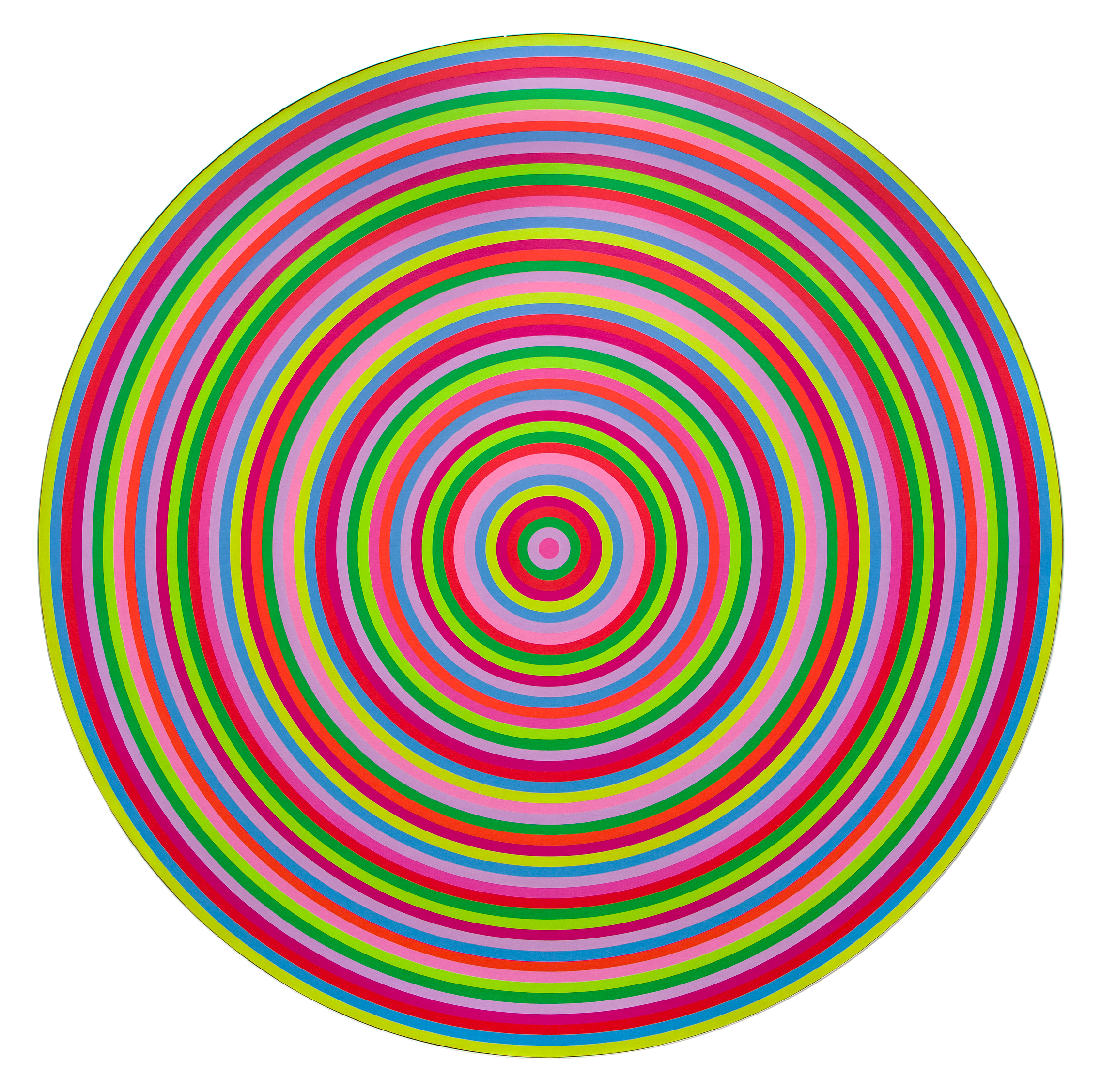
Claude Tousignant’s Accélérateur chromatique (1968) seems to defy the laws of gravity by reinventing the language of colour. This majestic painting would meet a destiny worthy of its greatness by becoming part of the prestigious Peter Stuyvesant Collection.

A remarkable provenance
In 1965, Tousignant took part in the exhibition The Responsive Eye at the Museum of Modern Art, in New York, and represented Canada at the 8th Bienal de São Paulo. This international exposure propelled his career to new heights and captured the attention of Alexander Orlow (1918– 2009), the keen-eyed executive director of the Turkish-Macedonian Tobacco Company (Turmac), in Zevenaar, the Netherlands. Guided by the most influential art museum directors in the country, Orlow built one of the most innovative corporate collections in the world and became the first executive to propose the idea of presenting modern art in a factory. The paintings, displayed on a rotating basis, were hung over Turmac’s factory floor and in its office areas. At its peak, the Peter Stuyvesant Collection comprised a vast body of more than fifteen hundred abstract and avant-garde works.

The collection was the subject of an exhibition titled The Art Gallery in the Factory, which was presented in Stratford, Ontario, and in Montréal in 1968, after which the National Gallery of Canada, in collaboration with Rothmans of Pall Mall Canada, toured it to nearly a dozen other venues in Canada. For the occasion, Orlow chose to complement the exhibition with works by Canadian artists, including Marcelle Ferron, Jacques Hurtubise, Guido Molinari, Jean Paul Riopelle, and Claude Tousignant. Orlow went on to acquire Accélérateur chromatique 90 for the Peter Stuyvesant Collection in 1970 (renamed the BAT Artventure Collection in 2002, when Turmac was acquired by British American Tobacco), where it remained until the Zevenaar factory was closed in 2008, at which time it was purchased by the Museum of Contemporary Art of Buenos Aires, Aldo Rubino Foundation.

The Accélérateurs chromatiques
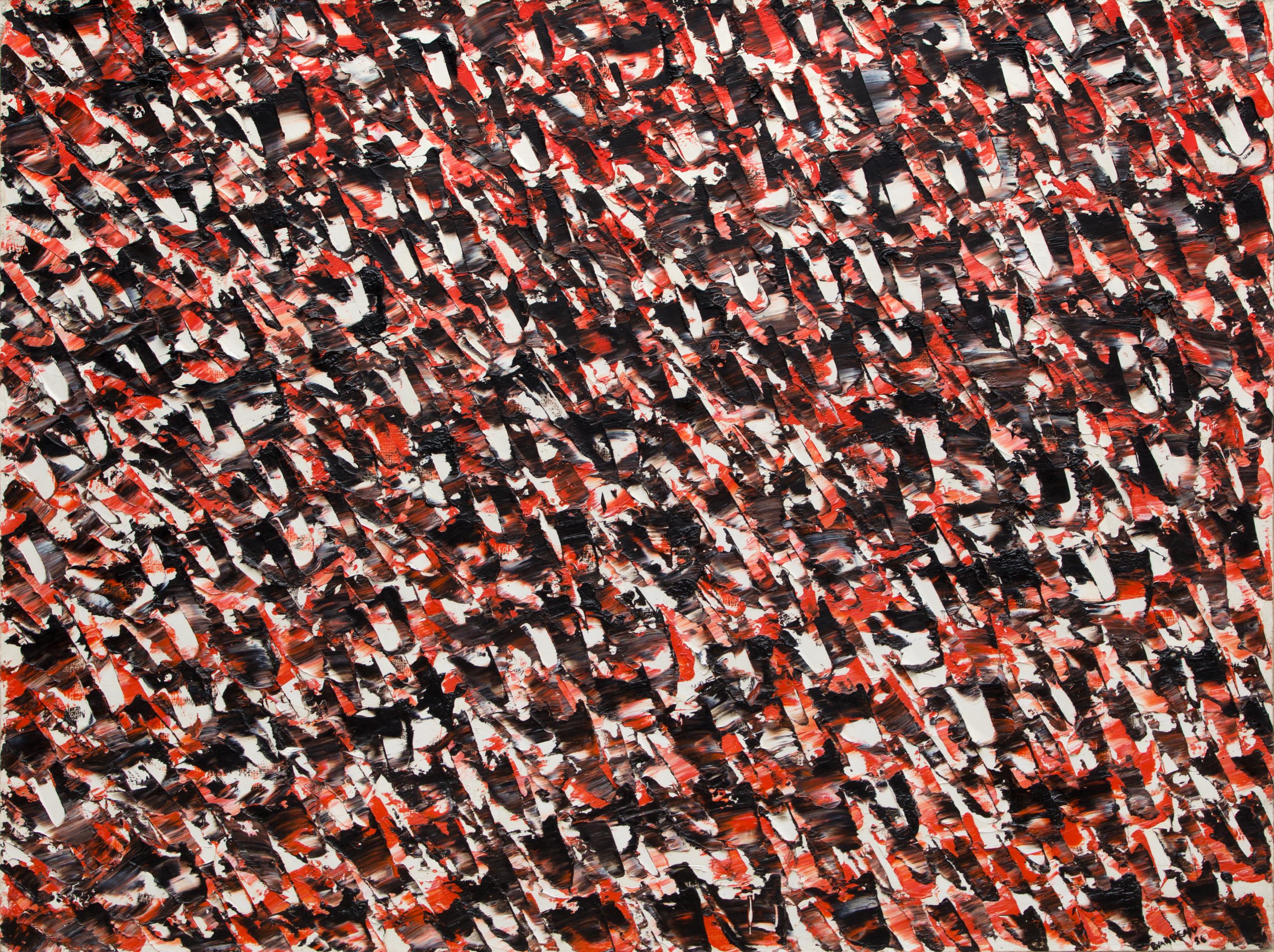
In his Accélérateurs chromatiques series, produced between 1967 and 1969, Claude Tousignant set out to conquer the pictorial field by devising a series of circular paintings of incomparable impact. One of the most astounding pieces from this body of work is undoubtedly Accélérateur chromatique 90, whose monumental diameter glorifies geometric abstraction. On its surface, forty-eight concentric rings are divided into seven distinct colours whose tonal sequence follows a rigorous method and precise calculations. The dazzling Day-Glo hues direct the gaze from the tondo’s beating heart to its outer edge like concentric waves around a pebble tossed into a pond. The stimulating colour combinations create a push-pull effect—a third dimension between the viewer and the work. Confronted with the dizzying experience of pure colour, the “body in space becomes the fixed axis of every circular movement,” writes author Paulette Gagnon.

At the time, Tousignant was exploring a concept of painting based on a return to primary matter—in other words, painting that is emptied of any superfluous references, a pure object of perception and sensation. He found the ultimate exemplars of this in Piet Mondrian, Edgard Varèse, and Barnett Newman. Tousignant explored the infinite possibilities of a form of painting that is “immediately understood,” an autonomous object, possessed of a spatial organization and dynamic internal interaction, that is totally devoid of all natural representation. “With Newman, I found a space of spectacular beauty,” he stated. “It’s exactly what I was trying to do in 1956: to say as much as possible with as few elements as possible.”

Tousignant, visionary painter
Tousignant’s formal vision quickly evolved around a constant geometry that ranged from the most austere rectangle to the most vibrant circular form. This search for equilibrium culminated in a structural exploration of the circle, which became his visual signature in the mid-1960s. In the Accélérateurs chromatiques, he demonstrated the inexorable power of this figure, as if it were a magnetic pole in which all retinal activity converged. The delicate rings of carefully considered colour reverberate in a sometimes centripetal, sometimes centrifugal chorus that undulates like “waves of chromatic energy.” Here, Tousignant manages to transcend pictorial space, achieving a kind of optical playground that feeds, rather than resolves, the enigma of pure colour. Within this space, the eye witnesses the blending of light in real time.(Annie Lafleur)


Marcel Christian Barbeau

Untitled, 1956


  • Estimated Price: $CAD 150 000 - 200 000
  • Medium: Oil on canvas
  • Dimensions: 36 x 48 inches 91,4 x 122 cm

In the spring of 1956, Barbeau transferred the research that he had conducted in his recent gouaches onto canvas. Animated by superb glimmering effects, this work was executed in a barrage of confident and assured gestures that shape and sweep across the canvas. Using just a few pure contrasting colours and his palette knife, Barbeau pushed the formal limits of the Tachist compositions that he had begun in 1946 and 1947, most of which he destroyed after Paul-Émile Borduas harshly criticized them. In Untitled (1956), his strokes seem to fling themselves into the fray as if pushed by a lateral thrust, while vivid touches fiercely punctuate the embattled checkerboard. Their oblique orientation adds density to the work’s eminently expressive motif.

This painting is a convincing example from Barbeau’s short series Nouvelles recherches, which features all-over compositions in a highly contrasting and restrained palette of black, white, and vermillion. At first broad and clearly defined, the strokes become smaller and denser, ultimately forming an inextricable fabric of marks and colours. The work’s formal rigour and incredible gesturalism transcend the composition to evoke “an eternally repeating image,” writes the art historian Ninon Gauthier. Executed in small, tightly packed strokes, the elements in the series explore the movement of light and follow a more sustained rhythm in works such as Prairie naissante (1956, 91.1 x 121.8 cm, private collection) and Natashkouan (1956, 182 x 213 cm, collection of the National Gallery of Canada).

In his preface to the catalogue for Barbeau’s retrospective at the Winnipeg Art Gallery, Bernard Teyssèdre notes, in reference to this series, “[Barbeau] achieved some admirable paintings in 1956, in an all-over technique that has some affinity with Riopelle’s, but they differ in their more moderate tension, more reserved colours, and the tendency to group the marks in a specific direction rather than layering them in a cosmic whirlwind.” Indeed, the density of the motif and the almost systematic alternation of colours intensifies the “quivering light” that skims across the surface. In February 1957, journalist Robert Ayre of the Montreal Star described Barbeau’s exhibition at Agnès Lefort in these terms: “Marcel Barbeau covers his canvas with colour pattern much like Riopelle does, but without Riopelle’s mosaic-like glitter; his have the texture of close-knit woolen textile.”

With this masterpiece, Marcel Barbeau concluded his Automatiste period and preceded many of his comptemporaries on the road to formal refinement. (A.L.)


Léon Bellefleur

Rêve-fusion, 1954


  • Estimated Price: $CAD 50 000 - 60 000
  • Medium: Oil on canvas
  • Dimensions: 27 x 33 inches 68,5 x 83,8 cm

In the mid-1950s, Léon Bellefleur’s art production grew more intense. Relieved of his teaching duties not long before, Bellefleur took inspiration from frequent trips to Paris. On a formal level, this sudden freedom is manifest in his creation of a new geometry and in his gradual, though determined, use of the spatula, a tool he favoured in subsequent works. Like many compositions produced during this period, this painting seems to emerge from darkness or twilight, as forms are broken up and proliferate into light, colourful, sinuous strands, following a topography that is both intuitive and precise. Soft swaths of white, blue sky, and spots of sunlight, like clearings in velvety though dense foliage, create stark contrasts with the heart of the work.

In 1948, Léon Bellefleur signed the Prisme d’Yeux manifesto, adding his voice to a group of Quebec artists led by painter Alfred Pellan. Published several months before Refus Global, the manifesto makes the case for an independent art open to highly diverse aesthetics, with freedom of expression taking precedence over radical doctrines. Bellefleur’s work was shown two years later in a joint exhibition with painter Fritz Brandtner at the Musée des beaux-arts de Montréal, in which around 30 paintings revealed “the inspiration of a personalized surrealist tendency that translates the turbulent depths of dreams and the nocturnal imagination into spontaneous pulsating forms,” writes Guy Robert. Freed from his work as a teacher in 1954, Bellefleur moved to France to dedicate himself fully to his art. Formal recognition came in 1968, when the National Gallery of Canada organized a retrospective that subsequently toured three museums. In 1977, Léon Bellefleur was the first recipient of the Prix Paul-Émile-Borduas. (A.L.)


Jacques Hurtubise

Rosamère, 1974


  • Estimated Price: $CAD 60 000 - 80 000
  • Medium: Acrylic on canvas
  • Dimensions: (polyptych comprising 18 square paintings) 48 ½ x 96 ½ inches (polyptyque composé de 18 tableaux carrés) 123 x 245 cm

In 1974, Jacques Hurtubise painted Rosamère, a continuation of his Blackouts series, of which another emblematic piece is featured in this sale. Rosamère is part of a group of large-scale polyptychs comprising numerous square canvases that Hurtubise assembled to achieve an optimal sense of balance. Splashes, drips, and hard edges collide, creating highly expressive positive and negative spaces, the embodiment of a measured and rigorous gesture. The palette, both austere (black and white) and vibrant (lime and emerald green, and pink), constitutes a pairing typical of this high-contrast era. Powerful black stripes—at times sharp, at others flowing—add a dramatic dimension to the composition, whose multiple layers reveal the reversibility of foreground and background. The present work is also reminiscent of the Brushstrokes series (1965–66) by American artist Roy Lichtenstein, underlining the distinct Pop Art influence observed in this period. Rosamère combines all the savoir-faire and aesthetic concerns of Hurtubise at the height of his artistry.


Marcelle Ferron

Hourvari, 1954-1955


  • Estimated Price: $CAD 90 000 - 120 000
  • Medium: Oil on canvas
  • Dimensions: 14 x 19 ¾ inches 35,5 x 50 cm

Mindful of the power of words and the impact of the palette knife, Marcelle Ferron’s intense and uncompromising vision reflects the commotion of imminent battle referred to in the painting’s title. In French, the term “hourvari” signifies not only a great tumult, but also a ruse used by prey to throw hunting dogs off their scent, or a command used to recall dogs who have strayed from their trail. Interestingly, the palette-knife strokes are organized in a kind of “pack” that seems to have deviated from its path in the upper-left corner of the canvas. The composition follows a grid defined by large, colour-inflected white impastos that give precedence to a pictorial space usually relegated to the background. This reverse effect is reinforced by the presence of absolute contrasts: pure blacks and reds arranged as supporting beams under an imposing structure.

Hourvari (1954–55) instantly captivates our gaze: the masterful gesture and rhythm play out in a composition that heralds the directional shift in Ferron’s formal approach shortly after her move to Paris. This work in fact straddles two remarkable trends in her production from the mid-1950s: the accentuation of light through flashes of white contrasted with brilliant colours and broader palette knife strokes. These layered touches give the composition as a whole a more structured, coherent order and a more obviously unified character. The richly coloured paints are loaded onto the palette knife and pushed across the canvas, creating “an effect that stimulates the eye from all sides,” writes curator Réal Lussier; the eye is attracted by the constant mirroring of marks across the entire surface of the canvas.

During her early years abroad, “Ferron took multiple trips, travelling to the Balkans, Greece, Italy, and the Netherlands, where she discovered new qualities of light,” notes Martine Perreault. In 1954, Ferron made her début on the European art scene by taking part in the exhibition Phases de l’art contemporain at Galerie Creuze in Paris, along with, most notably, Léon Bellefleur, Fernand Leduc, Jean-Paul Mousseau, and Jean Paul Riopelle. About this period, Lussier observes, “Her increasingly luminous compositions were created essentially from a restrained selection of colours that allowed the whites to practically vibrate.” (A.L.)


Jean Paul Lemieux

Les nuages, circa 1959


  • Estimated Price: $CAD 90 000 - 120 000
  • Medium: Oil on canvas
  • Dimensions: 21 x 32 inches 53,3 x 81,2 cm

Jean Paul Lemieux’s emblematic Les nuages qualifies as an instant classic. Both landscape and portrait, it is a subtle embodiment of the expression “head in the clouds.” The composition certainly does encourage daydreaming: we might be strolling through a field on a warm summer’s day, feeling the undulating valley beneath our feet. At the very end of the 1950s, Lemieux had perfected his most original subjects—the tilting horizon; the truncated figure; and vast, deserted landscapes that conjure meditative, interior spaces. As a whole, these portraits are characterized by the dramatic emotional charge they confer on their desolate landscapes, which sometimes verge on the abstract. Produced around 1959, Les nuages creates the illusion of infinite space through skilful brushwork that beautifully renders the endless sky behind the young boy. Beneath it, velvety green hills and valleys trace a simple horizon line that barely rises from the ground.

Indeed, our eyes fixate on where Lemieux pours much of his energy—the small, curious eyes that peek from behind their hooded orbits. But as the boy returns our gaze, he also gauges the horizon behind us. The contemplation is therefore reversed: we become the landscape that frees the figure from his shadow—an interpretation that offers a nuanced conclusion from this mature and perfectly composed work. Lemieux summed up his process this way: “I can start a landscape on the canvas, then transform it into a figure, then erase the figure to make another landscape.”

Here, the close-up view is cropped at the shoulders, emphasizing the curves that straighten into a long and slender neck, itself topped by a lovely round head with bright, mischievous eyes. The boy’s smiling lips, match the orange-pink hue of his glowing cheeks, create a sense of familiarity with the figure. The orangey-red sweater, featured in many of Lemieux’s emblematic portraits, adds a luminous touch to this magnificent portrait. Painted against the light, the boy sports a generous head of sun-kissed hair as he balances on the edge of Earth, emerging like a mirage, a vision, an oracle.

In the late 1950s and throughout the decade that followed, Lemieux’s reputation grew exponentially, both at home and abroad. He was honoured with solo exhibitions in Vancouver, Toronto, Montréal, and Québec City, and his works were included in four biennial exhibitions at the National Gallery of Canada. His paintings were also shown in exhibitions on Canadian art at the São Paulo Biennale, the Brussels World Fair, the Museum of Modern Art in New York, the Tate Gallery in London, and the Musée Galliera in Paris. He also represented Canada at the Venice Biennale in 1960. In 1966, Lemieux became a member of the Royal Canadian Academy of Arts. In 1967, he won the Canada Council Medal, and in 1968 he was appointed a Companion of the Order of Canada. (A.L.)


Jean Paul Riopelle

Hibou-roc, 1969-1970 (Fonte, 2010)


  • Estimated Price: $CAD 70 000 - 90 000
  • Medium: Bronze, lost wax | Ed. 4/8
  • Dimensions: 21 ½ x 17 ¼ x 10 ¾ inches 54,8 x 44 x 27,3 cm

The owl was a prominent theme in Jean Paul Riopelle’s work from 1969 and 1970, and many of his paintings, prints, and sculptures were inspired by this nocturnal bird. His love of sculpture was undeniable as well, as he found its techniques to be as satisfying as those of painting. In an interview with Fernand Séguin in 1968, on the Radio-Canada show Le sel de la semaine, Riopelle remarked, “Between the painting and the artist, there are tools—brushes, knives, colours—that must be dominated and controlled. But with sculpting, everything is at your fingertips, there are no tools in the way. The hand transmits its impulses directly into the clay.”

In 1969 and 1970, Riopelle produced more than fifty original sculptures in plaster and terracotta. Many of these were later cast in bronze at the Bonvicini Foundry in Verona, Italy, in 1989, thanks to the efforts of Galerie Lelong, which spearheaded the initiative. However, the recession put a halt to the project. Finally, in 2010, Hibou-roc, along with several other plaster and terracotta works, was cast in bronze at the Fonderie d’art d’Inverness, in Inverness, Québec.

The plaster version of Hibou-roc is featured on the cover of Riopelle: Studio Memories; details of its bronze cast are printed on the book’s inside cover flap and endpapers. (A.L.)


Serge Lemoyne

Assemblage nº 19, 1989


  • Estimated Price: $CAD 60 000 - 70 000
  • Medium: Acrylic on canvas
  • Dimensions: (diptych) 72 ½ x 65 ¼ inches (diptyque) 183 x 165 cm

In this imposing diptych, Serge Lemoyne continues to explore one of his favourite themes: his house at Acton Vale. Initially the family home, this legendary building became the studio that helped him launch his career. From the moment he purchased it in 1978, it became his main source of creative inspiration. It served as source material for sculptures and paintings in the form of disparate, collaged elements and works inspired by documentary photographs. In 1985, Lemoyne began his Assemblages series (1989–91), a thematic cycle based on his studio-home guided by a minimal palette of yellow, black, white, and grey.

In Assemblage no. 19 (1989), Lemoyne reproduces the corner of a wall from inside his home, based on a photograph that he ingeniously modified on the computer. The planes correspond to a mental architecture, a vision that pays tribute to a memory of that space. Drips flow across flat areas and bands of colour and over motifs, one of which is cut off on the left. Extending beyond the edges of the frame, the paint trails indicate continuous movement; they are a testament to the work’s physical presence. Lemoyne constantly sought to renew his pictorial vocabulary through innovative formal strategies that would make his work more accessible, popular, and unique. (A.L.)